

Increasing User Engagement And
Optimizing Page Performance For
Terra Foundation's Website
project overview
This case study aims to assess the usability of the desktop version of the Terra Foundation for American Art's website and address key concerns that maybe bring confusion to its users. With the use of data through behavior analytics, our team identifies problem areas and provides recommendations to improve engagement on the website.
tools
Google Analytics
HotJar
team
Akshata Karekar
Daniel Meagher
Katherin Aristizabal
Sara Shahnoosh
THE ASK
"Terra Foundation wanted to assess their website's user engagement since their brand new redesign."
So we asked some questions.
How are users navigating through the site?
Are users using the search icon to find information?
What actions are new users taking when considering applying for a grant?
In order to assess our client's objectives, these are the questions we asked ourselves.
Our team then planned to direct our research and analysis using these questions as parameters.
METHODOLOGY
After identifying our research questions and extracting scope to focus on, we used Behavior Analytics to analyse website user data for the client. Behavior analytics is a method for collecting and analyzing quantitative and qualitative user data to understand how people behave on and interact with your website and product and WHY.
We used tools like Google Analytics and Hotjar to learn more about our users.
WHAT WE LOOKED AT:
User Demographics
User Behavior
Acquisition
Conversion Rates
*Data from last 120 days

WHAT WE LOOKED AT:
Heatmaps
Scroll maps
Recordings
Click maps
*Data from last 30 days
OVERALL FINDINGS
who are our users and how are they interacting with our site?
THE WHO
Over 80% of our users were new, therefore we concluded that we needed to design for a user who has no prior mental model of the website's information.


THE HOW
Terra's website had good amount of active users as well as sessions. However users were only engaging with the site for a 1.5 minutes. We also observed that bounce rates were high indicating that users were not finding the information they were looking for.

A COLLABORATIVE ANALYSIS
to analyse our metrics and develop key findings
As a team, we analysed our overall findings and numbers that Google Analytics and HotJar gave us. We then individually digged deeper into the performance and engagement on the site to develop key findings and design recommendations to improve that usability issue. We shared out all our individual findings and grouped them under the most common usability categories to act as paramaters.

COLLABORATIVE ANALYSIS RESULTS
we specified our findings through the scope of our four objectives for the Terra Foundation site
Each of our findings and recommendations fall under 1 or 2 of these categories.
NAVIGATION
INFORMATION HIERARCHY
Is the navigation system helping users easily travel through the website?
Is the most crucial information on the website easily and firstly accesible to users?
COGNITIVE LOAD
CONVERSION RATES
Are users able to create simple pathways to engage with the information on the website?
Are users engaging with the call to action information on the pages?
KEY FINDING 01
Navigation + Cognitive Load
We found that users go back and forth between pages
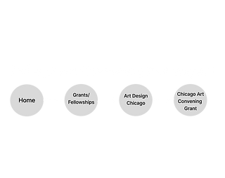
Users navigate back and forth between multiple pages on the website. This indicates that users do not have clarity about what information resides on which pages and where on the website.

RECOMMENDATION
Navigation + Cognitive Load
Integrate a breadcrumb menu on all pages
Our recommendation to solve this issue is to integrate a breadcrumb menu on every page. A breadcrumb is a secondary navigation aid and It allows users to keep track and maintain awareness of their locations within the website. Users will be able to click on any of the links on the breadcrumbs and be directed back to that particular page.
Visibility of system status: Add linked breadcrumbs to all pages on the website. Easy access for users to navigate to a previously visited page.
KEY FINDING 02
Navigation + Cognitive Load
We found that the top navigation does not match our user's mental model
The top navigation menu on homepage is not optimized or aligned with user navigation patterns or where they are seeking to find information on the site.

Users are clicking back and forth between “Who We Are” and “What We Offer” before landing on page desired page.
RECOMMENDATION
Navigation + Cognitive Load
Add "Grants" to the top navigation menu
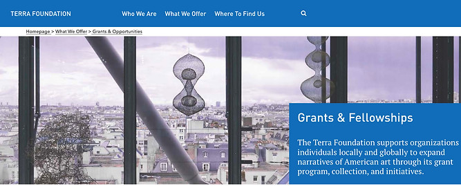
Add “Grants” to top navigation menu in place of “Where to Find Us”. Since Grants is the most visited page, including an easy access for users to access that page through navigation will help optimize user's time on the website and encourage them to explore other pages that branch from the Grants page.

Menu item click and hover state is now bolded with drop down icon to indicate submenu items below.
“Grants” added to menu in place of “Where To Find Us”
We also recommend an Open Card Sort
An Open Card Sort will help determine the best way to organize the menu items.
Open card sorts allow participants to create additional group names they think might be more appropriate.
KEY FINDING 03
Navigation + Cognitive Load
We found that less than 1% of all our users are using the search tool
We found there aren't any clicks on the search bar on Terra's website. This could indicate that users are not aware of the search tool on the website.

RECOMMENDATION
Navigation + Cognitive Load
Redesign the search icon into a search bar
A discoverable search bar on the website will let our visitors find what they are looking for faster. It helps users find what they need right away and make them more likely to come back to the website.

Newly expanded
Search bar tool for increased visibility / Discoverability.
KEY FINDING 04
Information Hierarchy
Most visited information on the website requires a lot of scrolling
Grants Program Guidelines have the highest clicks on the Grants page. However, 25% of the usersdon’t reach that section and head back to the homepage for information about Grants.

70% of page clicks
75% reach
Out of the users who landed on the Grants page, approximately 40% of them navigate
back to the Homepage.

In the same way, 50% of the total users reach the resources section on the Grants page. The other half navigate back to the homepage, or head to the grants database and Grants FAQ page through the navigation.

RECOMMENDATION
Information Hierarchy
Bring important sections higher up on page for discoverability
We recommend bringing the grant program guidelines and the resources section higher up on the page so that it falls within the average fold which is viewed by 100% of users. This way we will make sure that 100% of the users will reach this section, and approx. 96% of users will reach the resources section giving them access to the information they want in minimum amount of time.

Bring the Grant Program Guidelines higher up on the page.
Grant FAQ higher up on page as quick links
Average fold
96% of users reach this point
KEY FINDING 05
Cognitive Load
Some pages have low traffic and engagement
Some Grant pages have higher rates of traffic and engagement despite sharing similar opportunities, goals, and application windows. This discrepancy could be do to the lack of pathways and discoverability of some of these key pages.

22 total sessions
28 clicks
2 clicks to apply
84 total sessions
216 clicks
6 clicks to apply
4X session
8X engagement
3x application clicks

RECOMMENDATION
Cognitive Load
Add more pathways to other pages on the website
We recommend optimizing high traffic and high engagement pages by adding additional pathways to key pages. This way, we can utilize the users who lands on the high engagement pages and redirect them to other pages on the website, fulfilling the client goal of having the ser spend more than 5 minutes on their site.

Home Page
478 total sessions
626 clicks
63 clicks for grants and fellowship
Utilize Homepage for additional pathways to increase traffic

KEY FINDING 06
Conversion Rate Optimization
There is lack of visible call to action on the website
There is a bounce rate on the grants pages and the apply link has low discoverability. The apply button currently resides inside a dropdown menu for each grants page. The section fall in the bottom third of the page which makes it difficult for users to reach to.

74% bounce rate

Deadlines are the most clicked information by
new users

Majority of the new users will view and engage with the information that are presented above the fold
RECOMMENDATION
Conversion Rate Optimization
Place call to action within the average page fold
We recommend optimizing high traffic and high engagement pages by adding additional pathways to key pages. This way, we can utilize the users who lands on the high engagement pages and redirect them to other pages on the website, fulfilling the client goal of having the ser spend more than 5 minutes on their site.

Average fold
Place important information and a CTA above the fold to improve user engagement as soon as landing on the page.
We recommend to test this recommendation through an A/B Test. The hypothesis to be tested is: Having an “Apply” CTA on grant pages will increase engagement of that page leading to an increase in the page views to sign in to submit the letter of inquiry. The number of hits the Apply button gets can be tracked as a metric additional to page views through Google Analytics. The A/B test plan can be found here.

ORIGINAL
VARIATION
We also recommend an A/B Test
A QUICK RECAP
a visual summary of all our recommendations
.png)
CLIENT FEEDBACK
"These recommendations were absolutely insightful!"
We wrapped up our behavior analytics findings and recommendations by presenting them to our clients. We touched back on our research questions and our defined scope to fulfil our client goal of improving engagement and optimizing on the Terra Foundations' website. We got some amazing feedback form our client suggesting that they enjoyed the intricacy and depth of analysis of their website were eager to test out a few of the recommendations.

My learnings and next steps
The next steps to this project is to send out our A/B test plans using Google Optimize to our clients for them to implement our recommendations. A learning from this project is that a few times, quantitative data itself is not enough to validate a usability issue. There are various factors that affect the performance and effectiveness of a website and that can be measured through usability tests (like a card sort) in addition to data extracted from behavioral analytics tools for a well-rounded analysis of the website.
THE END ~