A Visit To The New Museum
A customer journey map designed from observing my teammates visit a museum.
Service Design 23/SP-INFO-697-06: Foundation 1 – In-context design ethnography
By Akshata Karekar
February 09, 2023
My teammate and I recently visited the New Museum in Bowery, New York. Below is a customer journey map that I designed to mark all the key moments of the visit, including pain points that I observed, along with opportunities to alter the experience referring to each pain point. Since we were a group of three, we observed and my teammate vocalized all her thoughts and feelings as she walked through the exhibits. I recorded all my observations in the notes section of phone, taking pictures and adding them next to my points for easy retrieval after the visit.
JOURNEY MAP with key moments, pain points and opportunities

KEY OBSERVATIONS + PAIN AREAS
To summarize the visit, after entering the museum, we are seamlessly lead to the ticketing counter where we showed our Pratt IDs and were given a free entry inside. However as we directed towards into the museum, we were expecting to see a visual map of the entry building. Since the building is pretty high, we expected there to be multiple stories with multiple exhibit ares, however there were only three that were actually open to public. We spent a lot of time deciding where we wanted to start with the help of the floor information that was on the wall next to the elevators. (Photo 3) Most people, just like us were standing in front of it, deciding where to go first but came to know what they were blocking the way of other visitors who were exiting the elevator as it opened. We ended up visiting the exhibit on that floor itself since it was under glass windows and we could see it.

Photo 1: Visitors crowding up the entrance of the museum by waiting for the elevator.

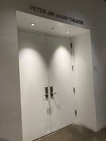
Photo 2: “Tickets Required” made us wonder if we had access to this part because we did not receive physical tickets. No indication that the theatre is closed for a private event.

Photo 3: A cafe, that is closed.

Photo 4: Floor navigation guidelines. A QR code that teammate did not scan thinking it would be about the exhibition and not a map. This had signs indicating the gift shop and restrooms, and also that the sky room was closed.

Photo 5: The title makes this big elevator door seem like it heads to a hall. Teammate could not figure out it was an elevator until it opened.

Photo 6: Staff directing some public to another smaller elevator that required her ID card to work. Unsure if this was open to everyone or only for special guests.

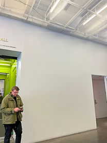
Photo 7: An opportunity for a map to be displayed on this big empty wall. A projector or a print, either would work and help visitors plan their navigation as they wait for the elevator.
Another pain point that confused my teammate was the flow to reading descriptions before entering the exhibit. Once again, the placement of information right next to the entrance was blocking off, and crowding the entry of the exhibit. A workaround for this issue that my teammate did was to reach the description from inside the exhibit. (Photo 8) I also observed missing signage near the entrance of the theatre to indicate that it is closed for a private event. My teammate barged into the room, feeling embarrassed as she was told by the security to step out. (Photo 9) In addition to that, as there was nothing more to view on this floor, we attempted to take the elevator but it did not give us any feedback on what floor it was on, or when it was arriving. There was no floor map to make a quick decision about where to go next. (Photo 10)

Photo 8: My teammate reading the description of the exhibition she is inside, from outside so that she does not block other public. Found it interesting that it was all glass.

Photo 9: Entrance to the theatre that my teammate barged into and was stopped. No signage that it’s not open to public.

Photo 10: Strange that the elevator downstairs has no feedback to where it is or if it’s arriving and in how much time.
As we moved on to other areas of the museum, I observed that there was no signage to indicate hidden exhibits in the building. Being curious, my teammate wondered where a blank passageway heads to and found that it led to a stairwell filed with more artwork! (Photo 11) After reaching the stairwell, we all struggled to look at the work since the stairwell was very narrow, and did not get a chance to absorb the work. This brought in another pain point of accessibility and inclusivity of the museum service design. Individuals with disability or incapability of taking the stairs would never be able to view those pieces which I thought was very unthoughtful (Photo 12). This made us wonder if there were additional exhibits that were hidden and we could not find, which made us feel unaccomplished in regards to viewing the museum. Referring to Photo 13, narrow entrances to a screen room was crowding up the space.

Photo 11: Teammate struggling to know if this passage goes anywhere. There is no signage at all, and we discovered that it goes to a stairwell with more artwork!

Photo 12: Too narrow of a staircase to stand and look at the piece. Could not take more than a singular person in front of each artwork. Overcrowding the stairs is never a good idea.

Photo 13: “Why are people watching from outside and not inside ? Even though there is seating inside?”
IN CONCLUSION
In conclusion, the overall experience of the museum seemed incomplete. Although my teammate did enjoy the artwork, she felt as if we had missed out on some of it. She was constantly looking for visual cues and signage to aid her navigation throughout the museum however could not find much so headed in her own curated flow.
An area that was completely missing was effective signage at the proper locations throughout the museum. There were a few touchpoints that made great spots for navigations guide but were not utilized.
Additionally, there was minimal use of technology in the museum. Apart from a QR code leading to a map of the exhibits, I think there are numerous opportunities to integrate interactive displays, sensory experiences (if and when the collection allows) and a website would be the best way to create a seamless and engaging customer experience. (Refer to areas of improvement on the customer journey)

Photo 14: A museum map that we found online AFTER our visit was over.
DESIGN PRINCIPLES FOR A SEAMLESS MUSEUM EXPERIENCE
EFFECTIVE WAYFINDING
to help the visitor quickly and efficiently understand the structure of the exhibits, where everything us and how to access and what sequence to access it.
CUSTOMER SERVICE
staff and guides who are aware of the content and placement of all exhibits, who will easily be able to answer visitor’s questions
ACCESSIBILITY
it is important that the information in the museum can be absorbed an understood by every individual.
TECH INTEGRATION
to seamlessly integrated technology such to make the museum experience better and memorable and also to provide necessary updates about the duration and availability of all exhibits in the museums.